Performance dashboards are important. Just ask anyone in a digital marketing field. Now, ask those same people if they use everything contained in that dashboard. They real answer is likely “no”.
Underutilized dashboards can waste resources, time, and money. Who should bear the responsibility of a dashboard that goes unused?
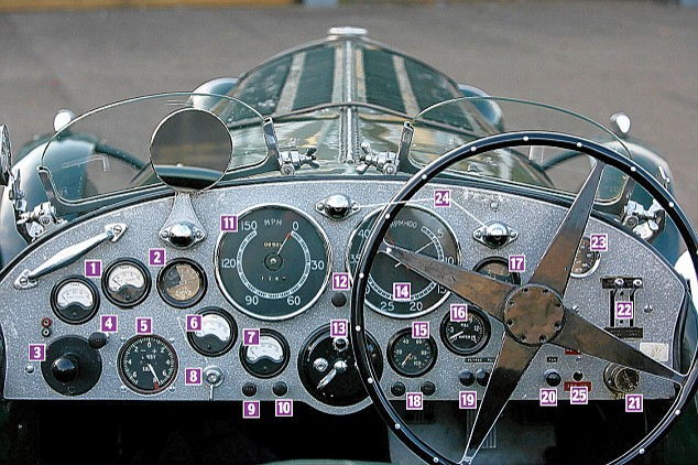
Let’s look at a dashboard we’re all familiar with: The car dashboard.
For 100 years now, we’ve seen the evolution of the automobile dashboard from simply a board to shield the driver from mud slung by the front tires. Since an upturn in performance and instrumentation, car dashboards have remained fairly static in terms of their contents. There are typically 7 main dials that have a simple design and metric on which to report.
They are:
- Speedometer (How fast are the car and its occupants going?)
- Fuel gauge (How much distance do we have to travel before the car stops?)
- Temperature gauge (Is this car running at a temperature that will cause serious damage?)
- Tachometer (Is the engine turning at a rate that’s harmful to it?)
- Oil pressure gauge (Are all parts of the car properly lubricated so they can function?)
- Charging system gauge (Is there enough electrical power to re-start the car?)
- Ammeter (Is there enough battery power to reach all devices that need it?)
What do these have in common? They are all essential in communicating the car’s safety and performance levels to the driver.
What does not appear on a typical car dashboard?
- Nice-to-haves: A driver has a couple of seconds to glean information from them. At 60 miles per hour, the driver does not have the time for extraneous data.
- Hard-to-understand visuals: The dials are designed to communicate one simple data point in a fast way.
What can we learn from 100 years of automobile dashboards when thinking about marketing performance reporting?
Despite available dashboard tools that offer many options, you have a limited amount of attention
Just like the core audience of a car dashboard is a driver going 60 miles per hour, your likely audience is an executive going the proverbial 100 miles per hour. They have no time to sift through complicated charts and likely don’t care which button color drove 10% more clicks to a landing page.
When creating a dashboard for executives, picture them in a board meeting. One board member turns to your executive and asks a core question about the business. Your dashboard should be accessible in one or two clicks on their phone, be clear, and relevant.
Stick to simple visuals that communicate one thing
A 2013 study showed that 98% of British drivers did not understand the warning lights on their dashboard. Many of these warning indicators are overlaid on the main dial. The marketing performance equivalent? The combination chart – three graphs in one but not one clear takeaway!
If mid-level contacts ask for specific metrics, create a second dashboard for them
The full dashboard in a car has other information like the temperature outside, the temperature inside, the current radio station, and air circulation controls. None of these are essential to the safety and performance of the car, but obviously passengers have historically cared enough about them for the car companies to offer the additional dashboard view.
The CMO, CRO, or COO may not care about banner performance, but the day-to-day team might. Give them their view, but don’t distract the top-level person from doing their job properly.
Have conversations with your core audiences about what’s critical and what’s not
The worst possible outcome of a performance dashboard is when it’s so unclear that the data within it is not used. While there’s a chance the audience is just lazy, it’s more likely that the dashboard is just not clear enough, simple enough, or relevant enough. What better way to improve this than asking the audiences what would be most helpful for them?
A solid dashboard leads to conversations that improve marketing programs. Poor dashboards don’t get taken seriously, making the term “data-driven organization” just an empty LinkedIn profile slogan.


